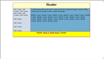
Three Columns in detail - an explanation of the techniques involved in this layout
- 4 Columns
- 3 col fluid

- 3 column fluid simple
- 3 column simple
- Content first
- 3 col centred
- Another 3 col

- Min/max 3 col
- 3 col no images

2 Column Layouts - based on this design


Start Right content goes here : Right content goes here : Right content goes here : Right content goes here : Right content goes here : Right content goes here : Right content goes here : Right content goes here : Right content goes here :
3 Columns Explained (circa 2004)
It's a shame that when most people convert from table layout to CSS the first thing they want to do is copy a table layout. I've always tried to avoid the problem altogether and use designs that suit CSS more than they suit the table layouts of old.
However, I've been asked so many times for a 3 col layout (that up to now was thought more or less impossible) that I decided to put what I knew into practice and produce a very passable imitation of the three column layout. Although this layout has some limitations it does in fact perform well against the browsers specified on the home page.
I should point out that if you want to use a table to do this then that's fine by me as we all make choices that we can live with. This article is for those of you who would rather avoid tables for layout.
First a brief rundown on what and how this is to be achieved:
A 3 column layout with equalising columns that has a footer at the bottom of the viewport if content is small, or footer at bottom of the document if content is greater than the viewport height. Any column can be the longest and columns can have borders and colours and always be full length.
This is achieved by setting a 100% high page. It would be easier if we used percentages because we could have a 10% header and a 80% body and a 10% footer. However this is not usually what's wanted. Most people want variable or fixed height headers and footers and content that automatically stretches between the two. In CSS you cannot specify something like 90% + 200pixels and try to make it 100%. It just won't work! So the idea is to set the page container to 100% and make sure all our content is contained within this container (except for the footer as mentioned below).
"Then why is your container only the centre column, we want three columns?" Patience I say! I will explain. We are creating a container that has margins on the left and right. These margins on the left and right are where we are going to float the columns. However, in order to continue influence on the 100% height we want we are going to float the containers from the centre column and then drag them outside of the centre column by use of negative margins. Neat Trick - although it's often used in other circumstances. The secret however is that if we float the floats outside the centre column completely they seem to loose their effect on expanding the middle column when their content is greater than the height of the column.
At this point most people have then abandoned this idea and resorted to try some other 3 column layout, however if you persevere you will find that by leaving the floats overlap the centre column by 1 pixel only, then the floats will influence the behaviour of the centre column in that it will force it to expand as required. Great !Just what we wanted - another problem solved. The details of overlapping etc can be avoided by using position:relative to shift the columns exactly into position so no problems there. Position relative moves the element visually and not physically so we still retain are overlapping effect.
Note: This 1px overlap is really only needed for older versons of Mozilla and netscape and firefox1.0 plus and IE do not need this overlap.
This technique in facts works very well and also allows us to put borders on the left and right of our container (centre column) that will divide our page into three. (No need for borders on the float now.) Obviously there are some places to insert clear:both after the floats but you can see that in the code.
The left and right column colours need to be the same as they are in fact the background colour of the body showing through. However it is a simple matter to set a repeating background image on the y-axis of the body that is just the same width as our float and gives the impression of the third column colour.
So far, we have a 3 column layout that is fluid and full size and has a header. "What about the footer then" I hear you ask again. The page is 100% high and if we add a footer as normal the footer will be beneath the bottom of the viewport. The way we overcome this is that we give the container a negative bottom margin to drag it up from the bottom of the window and allow the footer to pop into view. The margin you give it is enough to compensate for the height you give the footer. Therefore these 2 measurements work in tandem. In my example they aren't exactly the same because I allow for one to soak up some element margins.
It shuld also be noted that you could instead use a negative top margin on the footer to achieve the same effect or in fact a negative top margin on the main wrapper. ( Note: There is a more advanced and up to date foote example here here)
You may thing that we've finished now but I'm afraid the browsers have another surprise in store for us! Although we have specified a negative bottom margin for the container the browser still treat the container as though it was full height and the content carries on and disappears beneath our footer. What? Yes that's a blow but don't give up. All that's needed is a similar technique that we used with the header. We place an empty clear footer element at the bottom of our container and give it a height to match the negative margin (and the proper footers height). This clear footer element sits at the bottom of the container and stops the content from disappearing beneath the footer.
This footer technique needs explaining again so here it is :
The footer was a problem area and the #clearfooter was my fix to make it work.
The outer is 100% high but we have reduced the margin-bottom by 52px to allow the footer to rest at the bottom of the screen. However the browser still seems to think that the footer is still below the bottom of the window. This means that the content (text) flows under the footer for about 40px before the footer starts to move. Using a negative margin seems to cause this effect.
I tried margins and padding etc but these only complicated things so the easiest and also turns out to be the most efficient was simply to fill 40px (approx) up with nothing. Basically the clear footer sits behind the footer. The 40px is just enough to stop the content right on the footers edge (the divs default margins etc taking up the rest of the space).
If you don't like non-semantic elements you could just use padding on the immediate element above to soak up the space.
To see the problem simply then use this example code and enter enough text in the outer to make the div enlarge when the window is resized smaller. You will see that the text goes under the footer until it reaches the point where it was before. It's the same effect you get with relative positioning where the browser still thinks the element is in the original position.
<style type="text/css">
.outer {width:100%;height:200px;background:red;margin-bottom:-50px}
.footer {width:100%;height:50px;background:yellow}
</style>
</head>
<body>
<div class="outer">Outer - enter some more text here :</div>
<div class="footer">Footer</div>
</body>
</html>
Now that you've tried the above code out you can see exactly where the problem lies and how we have overcome it.
That's about it apart from tidying up and making it look nice. Now you know the basics here's a rundown through the actual code used so that you can relate it to the explanation above and know why it's needed and why it works.
Lets start with the main styles for the body and the outer container.
html, body {height:100%}
body {
padding:0;
margin:0;
background:pink url(leftcolbg.jpg) repeat-y left top;
color: #000000;
}
#outer{
min-height:100%;
margin-left:130px;
margin-right:130px;
background:#F8E7EC;
border-left:1px solid #000;
border-right:1px solid #000;
margin-bottom:-52px;
color: #000000;
}
* html #outer{height:100%;} /* IE6 and under treat height as min-height anyway*/
Body styles:
We need the page to be 100% high, which means 100% high of the viewport. This is done by setting html,body elements to 100%. Although IE only needs body {100%), mozilla browsers require the html element to be 100% as well. The html element is basically the root element i.e. the body element outside of the default margins.
Once we have set 100% height for the page other elements can also address this height and use it as a basis for calculations. Therefore we now set up a class called outer and set the height to 100%. This will make the outer element 100% of the html/body element which we already have set to 100%. This would be enough for IE6 and under as they treat height almost as minimum height. That is to say that if the contents are larger than the height of the element IE6- will expand it to contain the element. Other browsers are more strict in their interpretation of height and if content is greater than the container then the content will overflow. This means that we have to set up separate rules for IE.
This is achieved by setting a min-height of 100%, which IE6- ignores but other compliant browsers understand. We then use the * html hack to supply IE6 and under with a height:100% which hides it from other browers including ie7 which doesn't need it as it understands height and min-height perfectly well.
* html #outer{height:100%;}
This sets the height to be 100% but only for ie6 and under. Other browers have min-height:100% which allows the page to start with a 100% height but also to expand as required.
We also set padding and margins to zero to get rid of all the default margins on the body and all other elements bu using the universal selector * {}margin:0;padding:0}. Some browsers use padding for the default margins and some browsers use margins, so setting everything to zero gives us an even playing field. We also set the background colour in the body which will be the colour of our columns. To enable a third column colour a repeating image is employed that will follow the third column. (Always set a foreground colour when you set a background colour for good programming practice).
padding:0;
margin:0;
background:#fff url(leftcolbg.jpg) repeat-y left top;
color: #000000;
Next the main container #Outer
The outer is set to 100% which is 100% of the body as previously explained and then we need to make room for our left and right columns (remembering that #outer is to be our central column in the end) so:
margin-left:130px;
margin-right:130px;
border-left:1px solid #000;
border-right:1px solid #000;
This gives us our column space and also our borders for the columns. Obviously the size can be changed to suit your purpose.
Next we make space for our footer by using the negative margin technique as explained above:
margin-bottom:-52px;
The background colour specified in #outer will be the colour for our center column That's the main definition out of the way and is our building block for the rest of the page.
Next #header
#header{
background:#FF0000;
border-top:1px solid #000;
border-bottom:1px solid #000;
color: #000;
text-align:center;
position:relative;
margin:0 -131px;
padding-top:56px;
min-height:0;/* ie 7 haslayout fix */
}
/* mac hide \*/
* html #header{height:56px;he\ight:1px}/* height needed for ie to force layout*/
/* end hide*/
The header is placed in the main outer and its side margins are dragged outside the outer to fill the whole screen. This is similar to the way we move the columns with negative margins but for the header we drag both sides outwards to fit all the available space. IE again needs a helping hand and we need to force layout by giving it a height before it will take effect. Any height will do as ie always expands if content is greater than the dimensions set anyway.
Next : Cleverness abounds - the left and right columns:
#left {
position:relative;/*ie needs this to show float */
width:130px;/* same as the left margin on #outer*/
float:left;
margin-left:-129px;/*must be 1px less than width otherwise won't push footer down in older mozilla*/
left:-2px;/* push column into position*/
}
#left p {padding-left:2px;padding-right:2px}
#right p {padding-left:2px;padding-right:2px}
#right {
position:relative;/*ie needs this to show float */
width:130px;/* same as right margin on #outer*/
float:right;
margin-right:-129px;/*must be 1px less than width otherwise won't push footer down in older mozilla*/
left:2px;/* push column into position*/
}
The left column is giving position relative which still keeps it in the flow. This is to get over a bug in IE that sometimes won't show floats and their contents when a negative margin is used. (As an aside, adding position:relative to floats and images in IE can solve hundreds of missing images and redraw problems in IE. Remember this saying: "If
it doesn't show in IE try position relative" (or force layout mode with one of the properties from the list on the msdn site)). We do add a left:2px to push the column into position as already mentioned.
The float is 130px wide which is the same width as our margins in #outer. Next we drag the float 129px to the left using a negative margin. This keeps the float overlapping the main column by one pixel and allows the layout to work correctly as previously explained. Finally we add a 72px padding to the top of our float so that we don't have content disappearing under our header.
The right float is exactly the same except the float is dragged to the right. You may notice 2 other styles there (#left p and #right p)- these are used to set padding on the paragraphs in the float and avoids the broken box model of IE5 and 5.5.
To change the size of the column you need to remember to do three things:
1) Set the margins on the #outer to the size you want the float.
2) Set the float to the size of the margin you just set.
3) Set the negative margin to one pixel less than the width of the float.
That's all there is to it - Couldn't be simpler - well yes I suppose it could!
What's Afoot - #footer:
#footer {
width:100%;
clear:both;
height:50px;
border-top:1px solid #000;
border-bottom:1px solid #000;
background-color: #FF8080;
color: #000000;
text-align:center;
position:relative;
}
* html #footer {/*only ie gets this style*/
\height:52px;/* for ie5 */
he\ight:50px;/* for ie6 */
}
The above styles for #footer are straight forward and there's nothing you haven't seen before.( Remember clear:both will clear the footer from the floated content above.)
What may be new to you is the * html (universal) selector that I have used above. This is my preferred method of using the box model hack and just accounts for the border in ie5/5.5. broken box model. The * html is parsed (incorrectly) by IE6 and under as it should match no element as all other browsers ignore it, so it therefore turns out useful in supplying ie with values specific to IE only. The next hack is the backslash hack. When IE5 and IE 5.5. see the backslash in the middle of a property it ignores that property altogether and goes on to the next one. On the other hand IE6 doesn't have any problems with it, therefore we can give one set of values to IE6 for the correct box model and another set to older versions of IE with the broken box model. (To read more about this just do a search for star selector hack and SBMH (simplified box model hack).
Finishing stretch.
#clearfooter{clear:both;height:40px;}/*needed to make room for footer*/
* html #centrecontent {height:1%;margin-bottom:12px}/* combat IE's 3 pixel jog */
The last style with the star selector is a very useful hack for ie's 3 pixel jog on floats. Content following a float is automatically padded out to make way for the float. However when the float ends IE isn't consistent in the way it has handled the padding and you get a 3 pixel jog in your layout that can' be fixed. Unless you use the method above of declaring a 1% height for ie only (using the star selector hack). Remembering that ie treats height as min-height it will expand automatically so it has no detriment to our floats. The point being that setting either a specified width or height to our content cures the 3 pixel jog. We are unable to specify a width because we are using margins to dictate our width so therefore we use the height method. We also add a negative margin to the inside of both floats to compensate again for the three pixel jog.
So now not only have you got a 3 column fluid layout you also have a handful of fixes to the most common problems with CSS layouts. What more can you ask for?
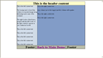
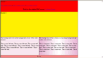
Here is how the html should be laid out:
<body>
<div id="outer">
<div id="header"> <p>Header - Centre column longest - footer at bottom of document.</p></div>
<div id="left"><p>Left Content goes here : </p></div>
<div id="right"><p>Right content goes here : </p></div>
<div id="centrecontent"><p>Centre Content goes here</p></div>
<div id="clearfooter"></div><!-- to clear footer -->
</div><!-- end outer div -->
<div id="footer"> -Footer -</div>
</body>
Looks pretty simple now doesn't it?
The above techniques work well with 100% wide and high layouts as you can utilise the body background to give you your solid column colours. I stated that the layout doesn't work in ie5 mac but if you don't mind dropping down ti mac quirks mode then you can make a passable version that works in ie5 mac also (2 column version). It should be noted that all versions of opera fail to redraw the footer properly if the bottom of the viewport is resized. However on initail load or on refresh the footer is positioned properly. This has been an underlyng problem in OPera for some time now.
I hope you have enjoyed this explanation but if you have any queries on the layout you can contact me directly at paul@pmob.co.uk.
Here are a few other random layouts (untested mostly)
- Three column double header
- Three fluid columns with 3 colours
- Two column centred
- One column centred
- Another Three column
- Three column with fixed header and sidebar
Back to Top