Image aspect ratio Explanation and Demonstration
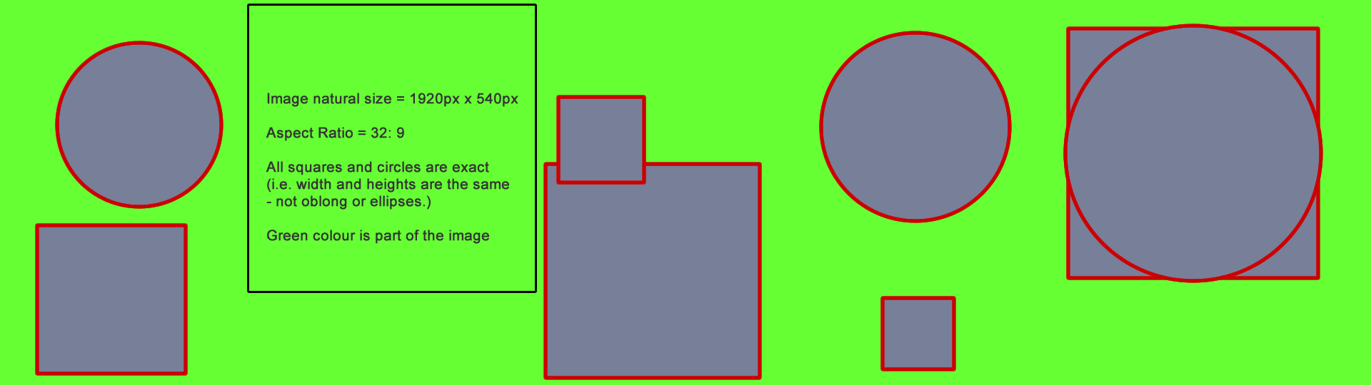
We are going to use the same image in the following examples and its size is 1920px x 540px natural width and height. That gives it an inherent aspect ratio of 32:9. It is displayed below in its full and untarnished state (that's why you will need to scroll the box to see it all).
If we now insert that image into the following code supplied by Neil we can see what happens to the image.
HTML
<div class="container">

    <div class="image"><img src="images/img1920x540.gif" width="1920" height="540" alt="16:9 aspect ratio"></div>

    <div class="text"> Lorem ipsum dolor sit amet, consectetur adipisicing elit. Doloribus aliquid eius quia expedita illo sequi optio labore assumenda. </div>

    </div>
CSS
.container {

    background-color: #FFEEDD;

    display: flex;

    }

    .container .image {

    flex-grow: 1;

    }

    .image img {

    display: block;

    max-width: 100%;

    max-height: 300px;

    }

    .text {

    flex-grow: 1;

    }
Below is the actual code inserted into this page so you can see the effect by opening and closing your browser window.
Neil's Result
Here is a screenshot of this actual page at a width of 1080px using the code mentioned above.
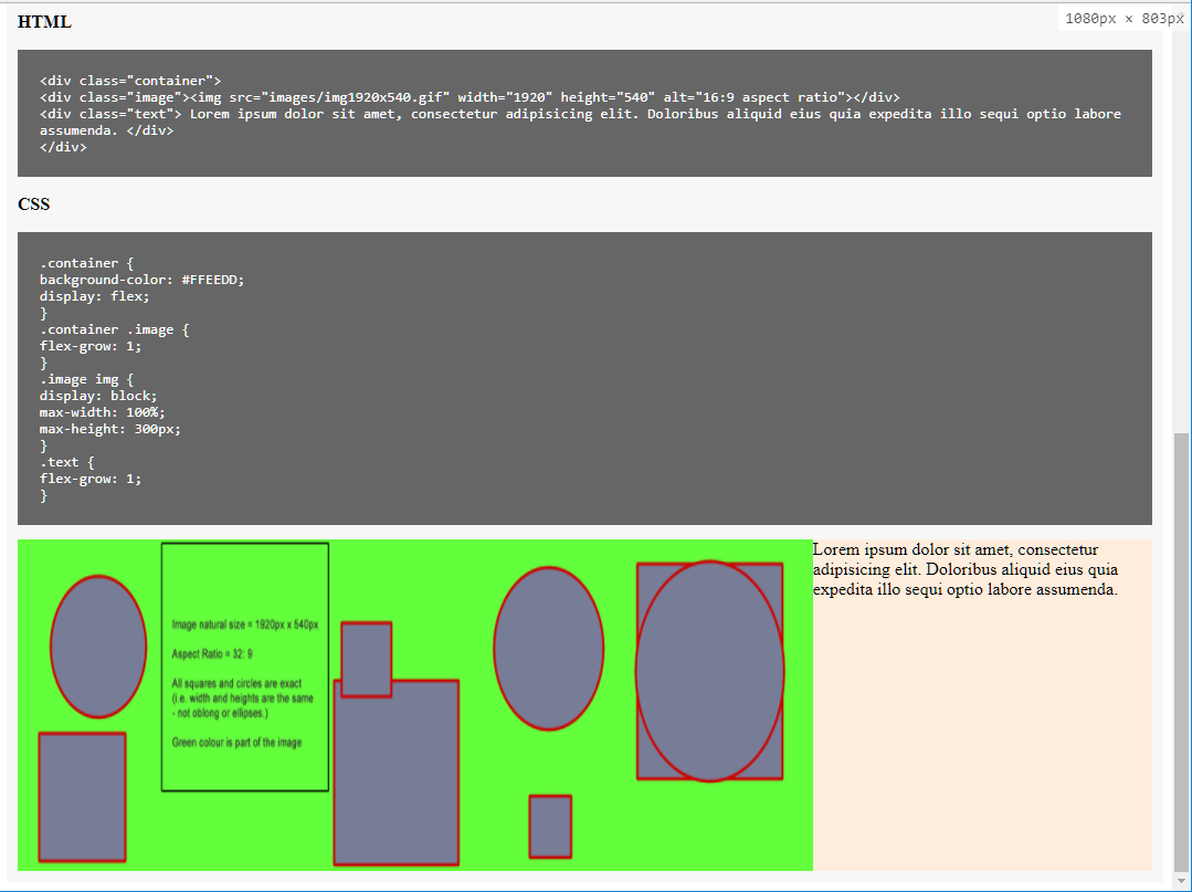
As you can see the squares and circles are no longer square or circular at 1080px screen width. They are distorted to fit the available space. The only time the image will not be distorted at 300px height is when the space available is 1067px or more (assuming the image isn't stretched after that point also). Assuming we have set the height to 300px then the natural image width would need to be 1067px as mentioned. For the image not to be distorted the width and height must always stay in synch. In this example page the image will only show at a true size when the window width is around 1700px or larger. Of course, if the aspect ratio of the image was different then all figures will be changed accordingly.
Using object-fit cover
If we add object-fit:cover to the element (ignoring IE11 for this demo) then you can see from the screenshot below that the image is no longer distorted but will show signs of cropping.
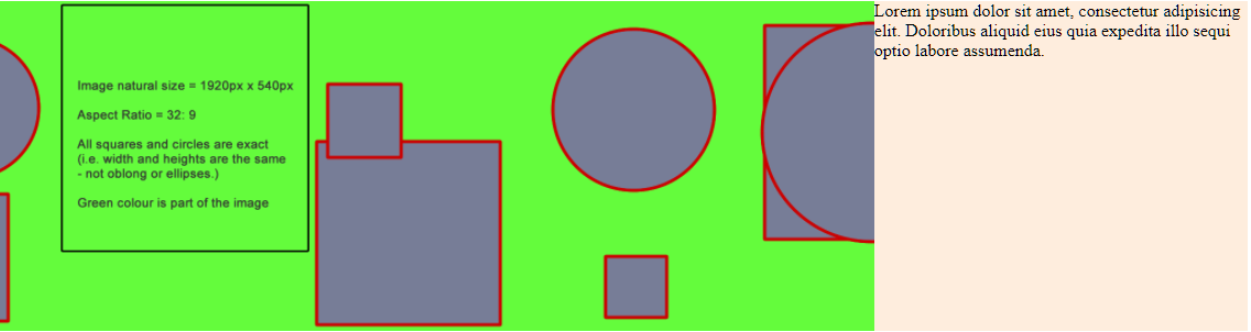
As you can see the image retains its aspect ratio when using 'cover' and is not distorted at all. However in order to maintain the full height the left and right of the images are cropped.
Using object-fit contain
The following screenshot uses object-fit:contain and now the image is no longer cropped. It also maintains its aspect ratio but in order to show the whole image it no longer fills the available space fully.
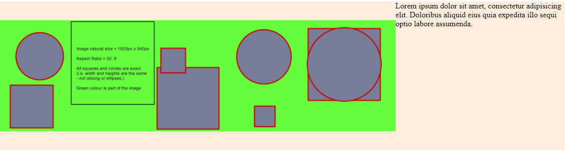
This time the whole image is displayed correctly but its dimensions are reduced until the whole image fits into the space available while still maintaining that important aspect ratio setting.
Conclusion
In essence the basic choices are simple:
- Maintain aspect ratio by using width:100% and height:auto. Simplest option will work for most cases but may result in small images
- Maintain aspect ratio by using width:auto and height:100%. Requires enough room for the full width of the image to be displayed which is unlikely to be true unlike auto:height.
- Maintain aspect ratio by using object-fit:cover (or background-size:cover). Image may be cropped but will fill whole area.
- Maintain aspect ratio by using object-fit:contain (or background-size:contain). Image will not be cropped but will be shrunk to fit the area resulting in gaps if a specific area to be covered is required.
- Stretch/squash the image to fit so that it no longer maintains its aspect ratio but does fill the space. Hint: Do not do this unless the images are just random shapes or colours.
Remember this demo just use a single image of a natural size of 1920px x 540px giving an aspect ratio of 32:9. In most real scenarios the image sizes used would most likely be of different sizes and the aspect ratios unique to all so the results above would look completely different
In the end the choice you make depends on your use case for the image. If the image is content and needs to be seen in whole (both full width and height of image need to be seen) then you would need to avoid using 'cover'. Whatever method you use though should not result in an image being squashed or stretched from its inherent aspect ratio.